iOS 18 Camera app [left]iOS 26’s version [right]
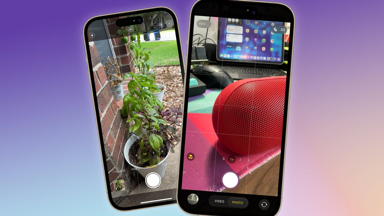
The iOS 26 Camera app overhaul is one for content creators, simultaneously streamlining the UI while also making managing formats and resolutions less frustrating.
The Camera app has always been an important way for Apple to sell its iPhone to consumers. With a reasonably simple interface, it allowed for images to be quickly taken and stored in Photos.
With some digging, it also provided ways to accentuate the shots in different ways, such as panoramas. It also handled video, with users able to take advantage of things like recording in ProRES video or in LOG format.
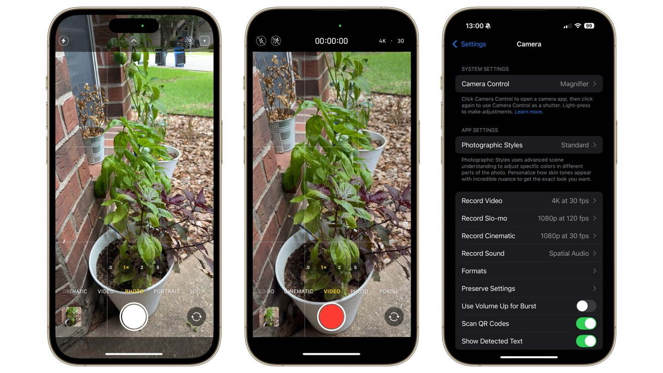
The Camera app in iOS 18
For iOS 26, the Camera app has been given a big overhaul in appearance and in utility. One that aspiring YouTubers could probably appreciate.
Streamlined UI
The Camera app has always enjoyed a spartan interface. You had a number of options available to you onscreen, but they were minimally disruptive while you took your shot.
The new Liquid Glass approach takes this idea and runs with it some more. There is now comparatively less to get in the way onscreen for a photograph.
For a start, the shutter button has been raised up and separated from the rest of the base edge interface, making it clear where you should press when the time is right. It’s also much closer to the magnification options.
The previous interface had the row of camera functions between the shutter and the zoom levels, but this time it is below the shutter. This is much more out of the way than before, and it makes sense as you don’t really need to see or change this when you get to the point of taking the actual shot.
The photo view, selecting different modes, and settings within Camera for iOS 26
The line of functions has also been adjusted, with the row truncated to show just Photo and Video by default. A press and a swipe of these will bring up the rest of the options, as the small glass pill widens to push the camera switching and Photos elements temporarily out of the way.
The top of the screen also has extra settings, as usual. However, while iOS 18 had a small arrow button to add more or less to your view, iOS 26 has a small icon in the corner to bring up a much larger menu.
This certainly tidies up the interface, removing a few more elements from the default view. But when summoned, the large size of the icons makes them very easy to actually use.
Apple’s Liquid Glass motif doesn’t really help that much here. But the changes in layout it prompted certainly improved the app.
Better resolution options
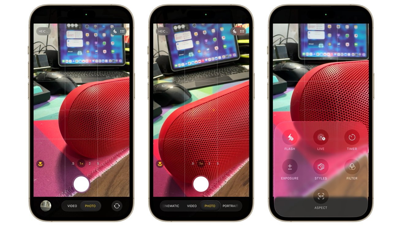
One thing that was an issue with the old camera app was that some important settings were buried away in the Settings app. This is still the case, as you have to delve in there to access a few important toggles under Formats.
Tapping toggles for ProRAW & Resolution Control, as well as Apple ProRes, brings up some extra icons in the main interface. However, this time, the presentation makes a lot more sense.
With these enabled, details in the top left corner appear, showing the format and other settings of the video or image. At a glance, you can see the frame rate, resolution, and format of the video, or the format and resolution of the image.
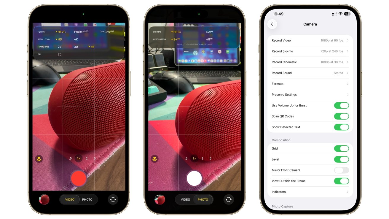
Resolutions are easier to select in-app, but you still have more options in Settings.
Tapping these expands to give you options, so you can switch to RAW for images or switch to a 48MP shot for a photo. Under Video, there’s options for ProRES under HDR or LOG, a 4K resolution, and frame rates between 24 and 60.
This is a massive ease-of-use difference versus iOS 18’s Camera, which was much more limiting for photos. For video, it was mildly frustrating as you had to tap to cycle between frame rates and formats.
Just like last time, you could go into the Settings app to set presets for video and to change functions. There’s still a lot of options to configure in Settings full stop, but it’s nice that these more essential items are more easily adjustable within the Camera app itself.
A play for creation
Apple’s changes are certainly something that could be considered an evolution that ties into the whole Liquid Glass ethos. The Camera is meant to be an intuitive app, one that offers the basics for taking an image while allowing those who dig a little deeper more freedom for their imagery.
As if you want the app to get out of the way of the user.
The UI switchup certainly minimizes distractions from the act of production this year. Crucially, it does so while also remaining very useful and configurable.
The ability to set the resolution and framerate settings to be more easily changed at a moment’s notice is a huge play for the content creator crowd. Resolution and switching between ProRes LOG and normal video settings is invaluable for people who want to be in control of what they shoot.
To a point, the previous camera’s small pain points could’ve forced some videographers over to third-party apps that granted more control with less frustration.
What Apple has done is given content creators more of a reason to stick with the default app. With better resolution and management of some essential settings more readily available, there’s less of a need to go to a third-party app for video production.
It’s a minimalist improvement, but one where the changes are done in the right way.

