Beyond Liquid Glass, Apple is making giant updates to Control Center in a href=”https://appleinsider.com/inside/ios-26″ title=”iOS 26″ data-kpt=”1″>iOS 26 that make this always handy iPhone feature become a powerhouse — once you learn how to use it to its fullest.
For example, you now automatically get several pages of controls plus you can add more, and Apple provides hundreds of its own iPhone controls for you to use. But Control Center can include options from third-party developers, and in iOS 26 finding and using all of these controls has been made much simpler.
Visual changes
What hasn’t changed with Control Center is how you get to it — and the fact that there are probably iPhone users who’ve never intentionally opened it. To get to Control Center, you must swipe down from the very top right of your iPhone screen, and to get rid of it, you swipe up from the very bottom.
Once you are in it, though, then there have been three very significant visual changes:
- Multiple pages
- An off button
- Liquid Glass
The smallest of these and sometimes the handiest, is that off switch. Instead of having to know that you switch off by pressing and holding the sleep/wake button for long enough, or by going through Settings to find Shut Downyou now tap and hold the off button.
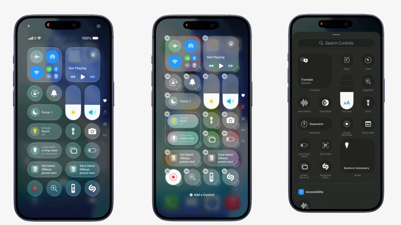
Notice the row of page icons down the right hand side of Control Center
You won’t need it often, but when you do, it means turning off the phone is one swipe and one tap — followed by another swipe to confirm you want to do this.
This off button is at the top right of the Control Center screen and it stays there even as you swipe through to the quite new extra pages. To go through these pages instead of dismissing Control Center, you have to swipe from anywhere except the very bottom of the screen.
Then the last thing to note about the off button is that it may be small, but it’s very clear. Initially during the first betas of iOS 26 and iPadOS 26, you couldn’t say that about every other Control Center icon because of how Liquid Glass made them all transparent.
They still are, but now it’s more like they are frosted glass. Opinions vary over Liquid Glass, but here on the iPhone and iPad, it’s a design that makes the controls stand out and easier to find.
Which is key because there are so very, very many of them to find. But that’s the key benefit of Control Center today, and it’s why there are now multiple pages.
How multiple pages work
By default, when you swipe down for Control Center, you get a version of the familiar page the iPhone and iPad have had for many years. But you can continue that swiping motion, literally just keep going, and you move to another page.
Or at any point when you’re using any page on Control Center, you can swipe up and down to get to the rest. Equally, if you know you just love what’s on the fourth page, you can tap on the icons hidden to the right side of the screen, and go straight to where you want.
That set of icons is very easy to miss, but once you know they’re there, they are also very handy. They start out with four icons, representing each of the four default pages:
- Favorites
- Music
- Home
- Settings
It’s possible to add more pages — actually, it’s extremely easy to add them inadvertently — and when you do, the list of icons grows. Where these original four get identifiable icons such as a note for the Music one, new pages just get a large dot.
But it’s the same idea, in that you can just tap on the dot to go to that page. And the list of icons shows the pages in order.
You don’t have to use any of these pages, though. That’s true in the sense that you never have to look at them if you don’t want to.
However, it’s also true in the sense that won’t ever need to, if you move all of the controls you like to the front page. That takes a couple of steps, but it’s easy enough that you will experiment with adding controls to find out which ones you really want.
And let us tell you right now, you can get into a muddle. Control Center does not stop you adding the same control over and over again, for instance.
But if you need to, you can open Settings on your iPhone, go to Control Center. Once there, tap on Reset Control Center to go back to Apple’s defaults and start again.
Getting read to add controls
Those Apple defaults are sensible, and familiar. They are the controls that perhaps most people want most of the time — and they are what have always been in Control Center.
So they range from volume and brightness, to Airplane Mode and Focus Modes. It’s a good set and it’s not as if there is an urgent or compelling need to change it — but you can.
L-R Control Center, Adding Controls, Choosing Controls
It’s just curious how you start changing or adding. You have a choice and it makes no difference at all, as you can either:
- Tap the + button at top left
- Press and hold on any blank space
Arguably the pressing and holding is better, because if you go to tap the plus sign, it’s easy to dismiss the whole Control Center.
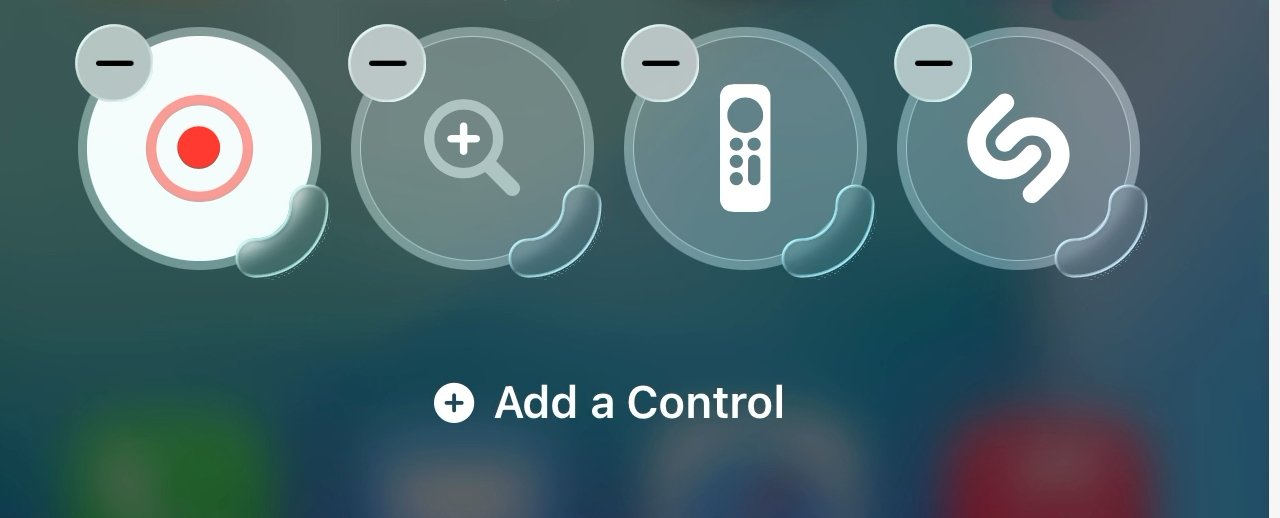
Nonetheless, whichever method you use, what happens next is that all controls on all pages, add a minus sign to their top left corners. They also strobe the edge of either each individual control or of a group of them.
Plus there will now be a button marked Add a Control.
Before you do that, you may want to clear some space or just get rid of controls you know you’ll never use. You don’t have to — the default set provided by Apple leaves room for a few more controls — but it’s simple enough to get rid of unwanted ones.
Maybe too simple. When the minus sign is showing, tap on that and the control disappears — without any further warning step.
Nothing is actually deleted forever, but depending on the control, getting them back can take some searching. As can adding any new control.
Finding and selecting controls
Once you tap Add a Controlyou are taken to a new and scrollable screen. It is potentially a very, very long scroll to the bottom as this screen contains all of the controls Apple offers — plus ones by third-party developers.
It is worth taking a look through the list because it’s divided into sections where potentially useful controls are grouped together into categories. By default, those categories are:
- General (an unlabelled section at the top)
- Accessibility
- Ambient Music
- Apple Intelligence & Siri
- Capture (camera, QR code scanner etc)
- Clock
- Connectivity
- Display & Brightness
- Focus
- Home
- Measure
- Notes
- Now Playing
- Reminders
- Remote
- Shortcuts
- Sounds
- Translate
- Voice Memos
- Wallet
- Watch
- Accessibility (curiously, a second one)
- Hearing Accessibility
- Motor Accessibility
- Vision Accessibility
If that seems like a long list to you, in truth you have a longer one. Apps that have followed Apple’s design recommendations before will already be included up in the list of possible controls.
Nicely, those third-party ones are interspersed throughout the list, which is chiefly shown alphabetically. So Apple hasn’t given its own controls any preference, the whole list is treated equally.
That includes whether a category includes one or many controls.
There are some oddities such as there being two Accessibility categories. The first includes just the iOS Name Recognition control, while the second contains the more familiar ones such as Accessibility Reader, and Guided Access.
Whichever control you pick from whichever category, you tap on it, and that control is immediately placed on your Control Center on whichever page you were on when you pressed Add a Control.
During the beta test, there have been the odd hiccup where a control didn’t seem to register the tap. But generally, it’s one tap and the control is installed.
It would great to be able to add a couple at a time, or perhaps all of the ones in a category, but it’s not presently possible. One control, one tap, it’s done.
Rearranging controls
While it’s usually true that the control goes on whichever page you were on when you pressed Add a Controlthere is an exception. When that page is already full, Control Center will add a new page and put that selected control on there.
Once you’ve tapped “Add a Control”, each icon gets a delete button and a grab handle for resizing
This can be unexpectedly confusing as, at least during the beta test, it seemed to sometimes be possible that you would come out to the page you started on — and there’d be no sign of the new control.
It would always be on the next page, always a swipe down, though.
And you can always rearrange any control’s position, move it to any screen — and also change its shape.
To move a control, press and hold on it, then just drag. When you’re doing this, Control Center shows targets, areas where you can drop controls, so you just drag to one of those and let go.
That target you drag to, though, needn’t be an empty one. If you drag to where there is already a control, that existing one moves somewhere else.
When you’ve arranged them all as you want, tap away from the controls and on a blank spot on the screen, and you’re done.
Except sometimes it’s handier to have a larger control. There are six options here:
- Small, round control
- Double-width horizontal control
- Triple-width horizontal control
- Quadruple-width horizontal control
- Double-height vertical control
- Double height and width control
Most controls can be changed to any of these. Some will limit you to a selection of these options — and the volume and brightness controls can’t be shrunk or grown at all.
To change any control that can be cahnged, Bring up the Add a Control button. Then when the controls have a minus sign at top left, they’ll also have a grab handle to bottom right.
It can be fiddly to press and hold on that handle to grow or shrink the control, rather than to grab it and move.
You do quickly get used to it, though, and if you were to keep rearranging Control Center controls, you’d be soon doing it without any conscious thought.
Only, you’re not going to keep rearranging them. You may fiddle at first, you may very well change the controls over time as your needs vary, but the idea here is to make it easy to set up and forget about it.
Maybe it’s too easy to make a mess, to have multiple copies of the same control, and definitely to accidentally have multiple pages.
But the new Control Center design, and its Liquid Glass look, is superb for surfacing controls you need. Set this up and the Control Center will be a powerhouse of your whole iPhone use.

